Using a Fusion Chart
When a report uses a Fusion Chart, it is made within ArteMIS using Flash
technology. To view charts made using Flash, you will need to install
Flash Player.
Click here to learn more about Flash Player.
Zooming into a Fusion chart
You can zoom into a chart to see more detail. This is handy if a pie
chart has many narrow segments, or if a line chart has many lines that
are close together.
Right-click on the chart.
The context menu will appear.
Click Zoom In
or Zoom Out as required.
To see the entire chart, click Show
All.
navigating around a zoomed-in Fusion chart
Although you can zoom into a chart, the chart remains within a fixed
frame. This means that, as you zoom in, some parts of the chart will fall
outside the frame and will not be visible. You can navigate around the
chart by dragging that chart within the frame.
Move the mouse cursor to an empty area of the
chart (i.e. the white background area). The mouse cursor will change from
an arrow to an open hand.

Click and hold down the mouse button, and then
move the mouse. This will drag the chart in the direction of the mouse
movement.
Obtaining extra information form a Fusion chart
Move
the mouse cursor onto a region of the pie chart or bar chart, or point
on a line chart. The mouse cursor will change from an arrow to a pointing
hand.

A floating caption will appear, containing extra information about
the selected region.
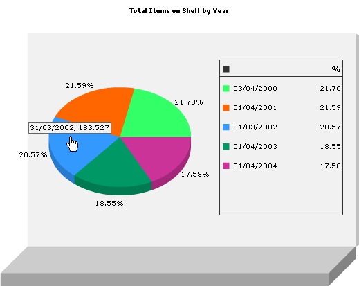
The example below shows a piece chart with the mouse cursor pointing
at the blue region. The tooltip provides the date for the region, and
the exact value from which the percentage was calculated.
Drilling down for further Information
Some Fusion Charts allow you to drill down to view further information.
This is a handy way to view the categories of information that were used
to make a particular element of the chart.
Click
on an element of the chart. If further information is available, it will
be shown as a new chart.
Click
the back button of the web browser to return to the previous chart.
Closing a Fusion chart
Click here
to learn about Printing a Report or Chart.